UI designer
The UI Designer is integrated at various points in the Vision plug-in. It allows to configure application-specific user interfaces, which are then displayed to the user at certain points during system operation. Such interfaces can be used, for example, to display information about the system, to adjust parameters or to start Viper.NET functions.
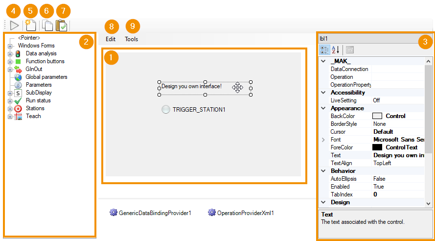
The UI Designer contains the UI panel (1) in the center, which shows a featureless preview of the UI. New UI elements are added by dragging and dropping them from the available elements list (2) onto the panel. The elements are selected with the mouse and arranged as desired. Each element has specific properties that are edited in the settings editor (3). The element is selected either in the UI panel or in the dropdown at the top of the Settings Editor. Here, for example, display properties such as the font size, or functional properties such as the action on a button click can be configured. The settings are described at the UI elements.
The remaining UI Designer controls provide editing support:
Open UI in floating window: Opens a functional version of the configured interface in a dialog window. The functionality can be tested here.
Reinitialize: Resets the interface to the initial, empty state.
Copy to clipboard: Copies the entire UI configuration to the clipboard. The function is suitable to transfer a UI to another place within Viper.NET.
Paste from clipboard: Pastes a previously copied interface from the clipboard. Already existing elements will be removed after confirmation.
Edit: Provides standard functions in a drop-down menu for editing individual UI elements: For example, undo, redo, or remove elements are offered.
Tools: Tools for editing the UI elements:
Tab order: Clicking in the menu disables/enables this mode. This displays and adjusts the order in which users switch between UI elements when pressing the Tab key. The order is displayed as small number overlays to each UI element. Clicking repeatedly will change individual priorities.
Surface elements
The available UI elements are grouped into categories according to their function. All are based on Windows Forms controls. The properties of the underlying control, which for example control the display, are all listed in the Settings Editor.
Additional properties that control Viper.NET specific behavior are grouped under _MAK_ in the categorized view of the Settings Editor. Most UI elements have three properties here:
DataConnection: Identifies a data object or function within Viper.NET to which the element is linked.
Operation: refers to an operation from the user-management. The access right of the logged in user controls the value of the set OperationProperty.
OperationProperty: defines a property of the UI element, whose value is changed by Viper.NET based on the user access right to the selected operation.
Hint
Operation and OperationProperty should be used to dynamically adapt the interface based on the rights of the logged-in user: The OperationProperty should preferably be the Enabled property, which visualizes and controls the usability of a visible control. The alternatively recommended choice of the Visible property hides controls when permissions are missing. The Operation should be set to match the selected DataConnection.
The DataConnection is selected from a list of available connections in a separate dialog. Only connections that are compatible with the type of UI element are displayed.
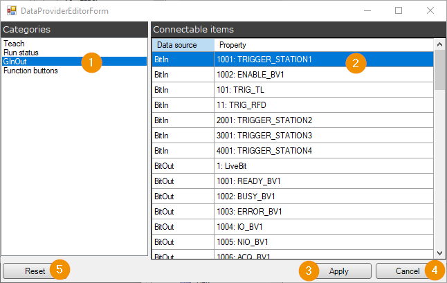
In one of the available categories (1) a list entry is selected (2) and the selection is confirmed with Apply (3). Cancel* closes the dialog without saving a new DataConnetion. Reset (5) resets the list selection to the currently set DataConnection.
Windows Forms
The category contains some standard building blocks from the Windows library Windows Forms . The main UI elements in this category are used to structure the interface:
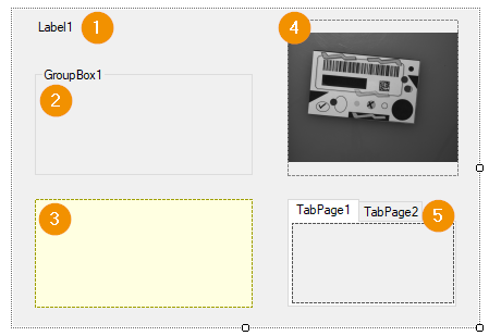
Label: Displays texts, often labels for other UI elements.
GroupBox: Visually groups multiple child elements by a labeled box.
Panel: groups several interface elements. The display can be controlled via properties, for example the background color or a frame.
PictureBox: For displaying images in the interface.
TabControl: Provides multiple switchable tabs, each of which can be populated with other UI elements.
Data analysis
The category lists all channels of Data-Analysis Tools as a separate control. In fact, each is a DataAnalysisResultControl2 whose DataConnection defaults to the respective terminal.
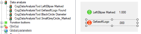
The UI elements visualize the evaluation result of the Data Analysis channel that is set in the DataConnection property. The channel name, the measured value of the last tool group execution and an icon that represents the result status in color are displayed:
red: reject or error
yellow: Warning
green: pass
Function buttons
Function buttons perform configurable actions when clicked.

Available are:
Link: Starts Viper.NET actions. In the DataConnection, the action to be executed is selected. The list of available functions contains both predefined elements, such as the manual-job-execution, and dynamic elements, such as links to the image-source-editors of the defined image sources of the ToolgroupItem.
Start Process: Starts external processes. An executable file and optional command line parameters must be set.
GInOut
The GInOut category contains UI elements for visualizing and controlling the defined GInOut data.
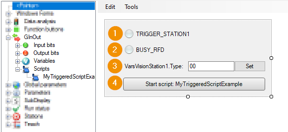
For all configured data areas, controls are offered in the respective group:
Input bits: Visualize the state of an input bit as a colored icon.
Output bits: Visualize the state of output bits as a colored icon.
Variables: Show the text values of GInOut variables. Clicking the Set button writes changes to the underlying data areas.
Scripts: By button you can manually trigger the execution of GInOut Python scripts.
Global parameters
Controls for all global parameters of the job are listed here. The interface displays the parameter name and value in each case. The Operation property should be used to specify that only sufficiently authorized users can adjust the values in the finished interface.
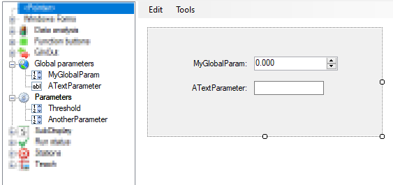
Parameters
All BV parameters are listed in the Parameters category. The controls are identical to those of global parameters. Parameter values can be modified by authorized users via the interface.
SubDisplay
With SubDisplay elements, Shared SubDisplays from the ToolgroupItem view can be included in the user interface.
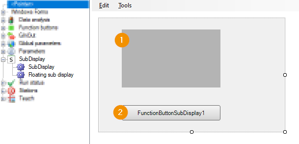
The integration can be done in two ways:
SubDisplay: Displays a customizable SubDisplay directly in the interface. The preview in the designer only shows a gray interface. In the final interface, scroll bars may be shown if the SubDisplay is larger than the defined display area. The SubDisplay to be displayed is set in the DataConnection.
Floating sub display: A button is displayed in the interface. If the user clicks on it, the set SubDisplay is displayed in a separate window. The SubDisplay to be displayed is set in the DataConnection.
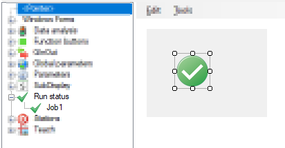
RunStatus
The execution status of the job can be visualized as an icon in the interface.
Stations
The Stations category provides UI elements for GInOut data associated with the handshake of a station. The available blocks are grouped by the associated stations.
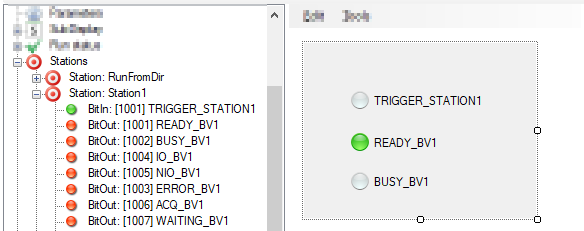
The UI elements are the same as in the GInOut category.
Teach
The interface elements in the Teach category help users set up or customize a configured image processing tool group.
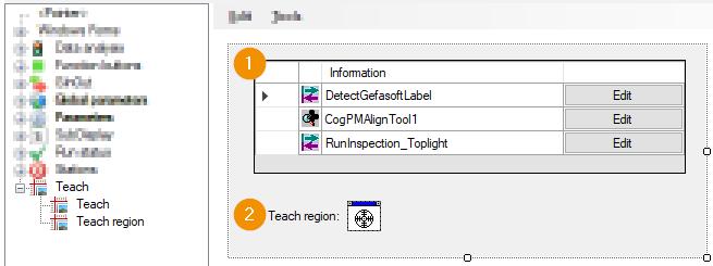
The category contains the following controls:
Teach: Shows a list of Shortcuts of important tools of the toolgroup. A click on the Edit button opens the Tool Editor of the respective tool.
Teach region: The control provides a shortcut to configure regions of VisionPro tools. Setting a region from the finished interface is done by the user dragging and dropping the displayed cursor onto a CogDisplay with a displayed image, for example an image view of the Job-Display. The overlay of the respective region can then be edited there. Which region sets a Teach region control is set in UI Designer with the DataConnection property. Properties of VisionPro tools named
RegionorSearchRegioncan be connected.